the second dime - mention
Yes, absolutely no doubt that the third, fourth and fifth dime mentions will also be called upon to pun-ish readers of my dailydime blurt in the future. In the last week or two I've had a couple of phone calls from various people asking me when will I actually be doing something with this dime thing and what is it all about etc etc. One of my friends actually asked me to come and fix his homelan if I wasn't too busy - now there's a major misunderstanding for you.
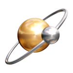
The logo above comes from a discussion about the creation of the ATOM rss feed logo and in some ways, I imagined that using something in the same vein would be fairly cool for dime. ( you already knew/guessed that d.i.m.e. was an acronym for Dancing In Molecular Energy, right ?) Anyway while the design is really cool and the whole 'quantum mechanics buzz be with you' thing is going on, there's just too many of them - not atoms - logos that use the hydrogen atom or the lunar earth relationship scheme - used everywhere from travel agents to creche's. So unlike an encounter with the Borg, this specific idea will not add to our distinctiveness if used in it's current form. And I'm not taking about using the actual image above - as that has copyright - if you want to you can check out it's evolution here:
http://www.intertwingly.net/wiki/pie/AtomArtwork
We need to come up with something original and functional that will support both - Dancing In Molecular energy and Digital Interactive Media Enterprises - so that's going to form part of discussions later today I would assume, how can we support the first aspect while also clearly representing the brand that creates, licenses, buys, co produces, digital media content and products in the commercial world
The whole second dime is the truly commercial aspect to the company, the element that will allow it to survive and prosper in the real material world , while also respecting the true ephemeral nature of material existence. It's getting harder and harder to get away from the atom style logo but one major drawback is that it's a lonely logo, just a couple of small spheres, pretty much out there on their own, so for that very reason we need to consider something else.
should make for an energetic discussion.
posted by Unknown @ 11:28 AM
![]()
![]()

0 Comments:
Post a Comment
<< Home